
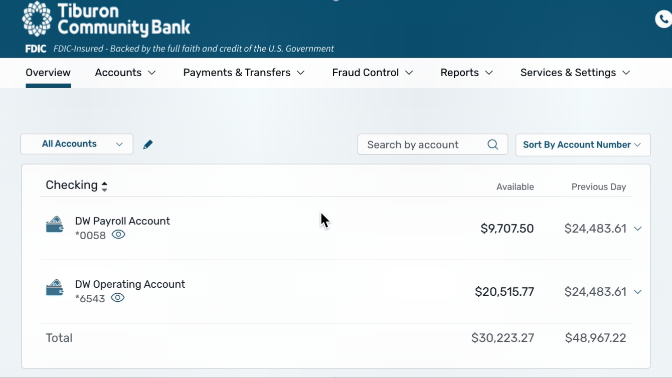
“Simplify the current experience”
The first image shows our previous online banking experience. I tracked a large number of “rage clicks” for the accounts on the page. This was because the click area was limited to just the name link of the account.
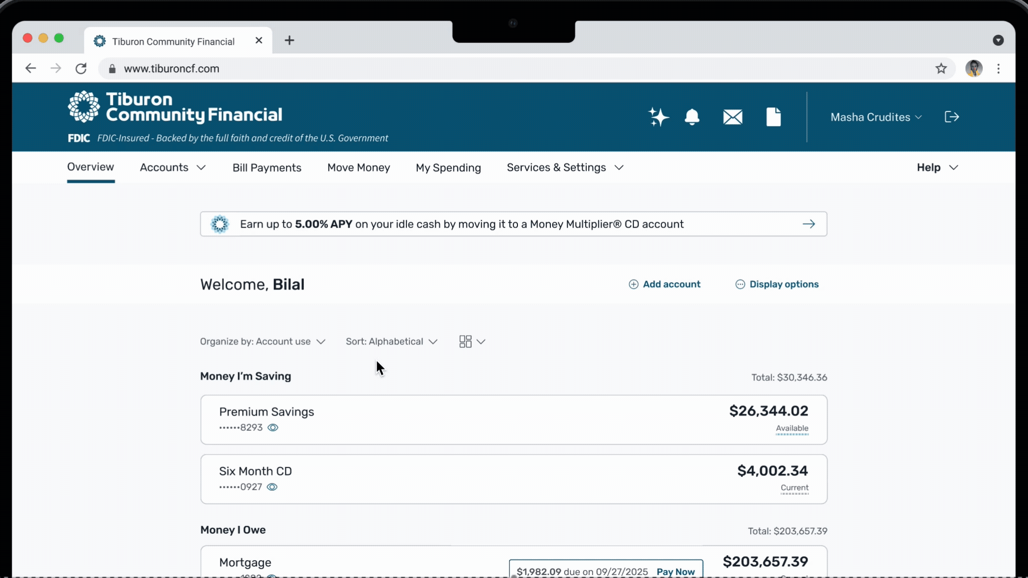
In the second image is the experience that I re-designed. I updated the account cards so that there would be a much larger clickable area for users. I was also able to pitch and achieve several other clutter reducing initiatives, such as removing the secondary balance and updating menus.